It gives me great pleasure to announce, that the Live Earthquake Mashup has been successfully updated to use Google Maps V3 and Simile Timeline V2. This should make the mashup compatible with more devices, and it should keep the page alive for some more years.
Visually, the differences to the old version are hardly noticeable - that is intentional. I had to struggle with the new APIs to achieve this effect. The only "visible" (or tactile?) enhancement is, that you can use the scrollwheel to move the timeline.
Many thanks to Mike Nosal, who helped me twice with updating the timeline part of the code, his assistance is much appreciated.
If you notice any problems with the page, please let me know.
Posts mit dem Label Karten werden angezeigt. Alle Posts anzeigen
Posts mit dem Label Karten werden angezeigt. Alle Posts anzeigen
2013-06-07
Live Earthquake Mashup updated
Executive Summary: Please take a look at the new version of the Live Earthquake Mashup. If you find any problems, please let me know.
[2013-06-13: Update] I've also switched to Timeline version 2. The coloring scheme is not what I want, but I am close...
Two years ago, I started searching for someone to take over maintenance of the Live Earthquake Mashup. Up to now, I got no response. During the last few months, erosion of the page became a very imminent threat, and action was needed.
In December 2012, Google informed users of version 2 of the Google Maps API, applications should migrate to version 3 by May 2013. Although the API is still available, and will probably be for some time longer, Google has recently shown, that they don't hesitate to pull the plug even on useful applications with a large user base.
Last month, the other external part of my mashup broke, when someone at MIT had the clever idea to play around with redirections on the SIMILE web server, cutting off version 1 of the Timeline. The timing couldn't have been better, because I was away on vacation. I managed to post a page explaining the situation, but was able to repair the mashup only when I was back home. The outage is clearly visible in the usage statistics:

Luckily, when the mashup was back online, access count seemed unaffected. A sad reality of this episode was, that during the outage I was contacted by nearly as many people asking for the page, as in all the time since the mashup went online in 2006, and has been available without any significant interruptions since then.
With this experience, I decided not to wait until Google removed the old Maps API, or for someone to take over the page. I started rewriting the mashup myself. I decided to deal with the Google Maps API first, because that seemed more urgent. I fixed the Timeline problem by simply copying the JavaScript code to my server. That is clearly not an option for Google Maps. If that is gone, it is gone for good.
I encountered some problems while converting my code to version 3 of the API, the transition is not as easy as Google wants to make the developers believe. Another disappointment was the help offered by the community. My question was probably not very well articulated, so receiving only two answers was understandable. But all in all less than 10 people actually clicked on the link to even take a look at the page I had problems with.
Anyhow, after some struggles I finally was able to come up with a page that should give nearly the identical look and feel as the old mashup, although it uses the new Google Maps API:
http://www.oe-files.de/gmaps/eqmashup-ng.html
As already mentioned above: Please let me know if there are any problems with this page. It will replace the current version of the mashup in a few days.
I will probably take a look at the Timeline part as well, and try to use version 2 of the Timeline API.
2011-03-23
What's in a Magnitude
As mentioned some days ago, due to the Tohoku Earthquake, a lot of people visited my earthquake mashup. The number of visits have decreased since then, but levelled off at a significant higher level than before:

During this time, one (and only one...) person contacted me about the mashup. Andy Adamson noticed, that in the earthquake swarms that flooded the area off the coast of Japan, it is hard to distinguish the really big quakes from the somewhat smaller ones:

He suggested to size the icons not according to their magnitudes, but to their actual strength. Andy works for the Gemini Observatory, which operates telescopes in Chile and Hawaii. I wonder how many long exposure images get ruined by earthquakes in those locations...
And indeed, the magnitude scale is logarithmic, so what an increase by one magnitude really means is not easy to grasp. In our daily life, we are used to linear scales, and only very seldom we find logarithmic ones. I remembered something like "an increase of one magnitude means a tenfold increase of released energy". I started to calculate corresponding icon sizes and soon realized, that it would be impossible to cover the range of all earthquakes from magnitude 2.5 to 9.0 and above this way. And only then I actually looked up the real figures: An increase of one magnitude means an increase of about 32 times the energy! 10 to the power of 1.5, to be precise. It would be impossible to visualize one single magnitude this way: Everything weaker would be represented by icons of less than a pixel, everything stronger by icons that are larger than the average monitor resolution (even by todays HD standards).
So as a compromise, I settled for an increase of a factor of 10 instead of 32, and with this figure, it was possible to come up with somewhat reasonable sizes for icons:

Magnitude 5 is barely visible, the big circles in the image above are about magnitude 6.5. Just to give you an idea, how this scale continues: This is the icon for a magnitude 8.0 quake, and this for a magnitude 9.0 one, i.e. the one that hit Japan.
As everything below magnitude 5.0 is too small to be seen, instead of adding some sort of filter to my mashup, I simply used the USGS feed that only contains earthquakes of this magnitude and above. So if you select the "USGS 5+" feed in the mashup now, you get (nearly) linear scaled icons, representing the energy released by the corresponding earthquake.
During this time, one (and only one...) person contacted me about the mashup. Andy Adamson noticed, that in the earthquake swarms that flooded the area off the coast of Japan, it is hard to distinguish the really big quakes from the somewhat smaller ones:
He suggested to size the icons not according to their magnitudes, but to their actual strength. Andy works for the Gemini Observatory, which operates telescopes in Chile and Hawaii. I wonder how many long exposure images get ruined by earthquakes in those locations...
And indeed, the magnitude scale is logarithmic, so what an increase by one magnitude really means is not easy to grasp. In our daily life, we are used to linear scales, and only very seldom we find logarithmic ones. I remembered something like "an increase of one magnitude means a tenfold increase of released energy". I started to calculate corresponding icon sizes and soon realized, that it would be impossible to cover the range of all earthquakes from magnitude 2.5 to 9.0 and above this way. And only then I actually looked up the real figures: An increase of one magnitude means an increase of about 32 times the energy! 10 to the power of 1.5, to be precise. It would be impossible to visualize one single magnitude this way: Everything weaker would be represented by icons of less than a pixel, everything stronger by icons that are larger than the average monitor resolution (even by todays HD standards).
So as a compromise, I settled for an increase of a factor of 10 instead of 32, and with this figure, it was possible to come up with somewhat reasonable sizes for icons:
Magnitude 5 is barely visible, the big circles in the image above are about magnitude 6.5. Just to give you an idea, how this scale continues: This is the icon for a magnitude 8.0 quake, and this for a magnitude 9.0 one, i.e. the one that hit Japan.
As everything below magnitude 5.0 is too small to be seen, instead of adding some sort of filter to my mashup, I simply used the USGS feed that only contains earthquakes of this magnitude and above. So if you select the "USGS 5+" feed in the mashup now, you get (nearly) linear scaled icons, representing the energy released by the corresponding earthquake.
2011-03-13
Ooooh, That Ripped!
As I had mentioned some time ago, the access statistics to my earthquake mashup are kind of a meta-seismometer: Whenever a large earthquake strikes, and people ask the 'net for information, some of them end up on my site.
The Christchurch earthquake from February 22nd made only a small, yet visible dent:

But the recent Sendai earthquake created a rush my site has never seen before:

Traffic increased by a factor of nearly 25 compared to the average level in the days before.
Let's just hope that the situation in Northern Japan and especially around the Fukushima nuclear power plant gets not completely out of hand. After earthquake, tsunami and nuclear meltdown, there would be only one thing left...
2009-10-10
Watching the Watchers
One of my pet projects, that I mention from time to time in this blog (just to increase its PageRank), is my Earthquake Mashup. This application has been constantly available since October 2006, and googling for the right keywords will get you there. Another toy using Google Maps is this page visualizing the locations of visitors to my web server. I realized some time ago, that I have actually created an earthquake detector, that shows the impact earthquakes have on people on the Internet.
On April 6th this year, I noticed a lot of requests from Italy in the logs of my website (which I "tail -f" occasionally). The visitors page agreed, a lot of requests from all over Italy were coming in, more and more every hour. What had happened? The city of L'Aquila in central Italy was hit by a magnitude 6.3 temblor. The main event took place already in the night, but it seemed that with the break of day and news covering the event, people started looking for information on the web.
I always wanted to analyze this rush on my mashup after large earthquakes, but somehow never did it. But then, two weeks ago, Sophia Liu from the University of Colorado contacted me. She works in a research group called "connectivIT" and specializes in the research of information technology in crisis. During a lively mail exchange, I decided to finally take a deeper look at the data I had collected. I learned long ago never to throw away log files :) and although I could have used all data way back from 2006, I used logs from February 2008 on, because at that time I gave my mashup a major overhaul and it got its present form.
First, I needed a speedy method for geocoding the IP addresses and hostnames found in the logs. For the visitors page I had used an online API by hostip.info. But this method seemed cumbersome for the amount of data, and a lot of addresses did not resolve to a location. MaxMind, who offers a commercial solution to this problem, distributes a lightweight version of their product for free, and the results looked much better. Plus: The command line version of their geocoder is part of pkgsrc, so I was able to use this tool within minutes. The visitors page now uses this method as well.
Geocoding IP addresses is not pure science, it involves a lot of faith, hand waving and voodoo. For example: IP addresses from my university (which owns what used to be a Class B network) are correctly identified as being in Bielefeld. The IP address I got assigned by my ISP right now is located in Hamburg, probably because that's the location of the company's headquarters. But addresses are assigned to certain regions in a defined way, so at least a rough location of the origin of a request is possible.
First I wanted to know, where all the people visiting the mashup since 2008 come from:

As you can see, the majority of requests comes from Europe, North America and Japan. Other regions are present as well, but with fewer hits. Of course there a several explanations: Most requests really come from these three areas, which is probably true. And I counted only those requests the geocoder could resolve to a location. My guess is, that addresses in other regions are harder to locate, due to less information on their distribution and use. Of course this unequal distribution has to be taken into account in all the subsequent deliberations.
Then I wanted to see the temporal distribution of these requests (i.e. only those I was able to geocode). Again, first on the global scale:

Technical note: I counted the daily requests to the HTML file of the mashup, not the other parts. This means, the numbers shown are roughly actual visits to the mashup. And keep in mind that the figures are relatively small, with 800 to 900 requests per day for the largest events. I guess the USGS website receives this amount of visitors within a few minutes on a calm day.
As you can see, there are some distinct peaks. Aligning their dates with this list, one can clearly identify the Valentine's Day earthquake in Greece (very first peak), or the Xinjiang-Xizang earthquake on March 20th, 2008. The very last peak stems from the two heavy quakes in Samoa and Sumatra, that hit the edges of the Australian Plate within 24 hours on September 29th/30th. Some peaks seem not to be related to an earthquake, e.g. those on October 14th/15th and 26th, 2008. I haven't investigated further, but this might have been a rogue web browser, that requested not only the data feed every five minutes, but the complete page itself.
One interesting fact is, that the catastrophic magnitude 7.9 Sichuan earthquake on May 12th, 2008, is only barely visible in the graph. It caused less traffic than a 5.4 earthquake in Illinois one month earlier. I don't have a good explanation, I can only speculate: If I remember correctly, my first thought, when I heard about this earthquake (and the high number of fatalities was not known then): "What? Another quake in China? Didn't they just have one?" The coverage of the March event was still very present. I think another reason is, that due to the previous riots in Tibet, journalists were very restricted, having problems getting into the affected region and reporting about the event. This meant less news about the earthquake, at least less TV images from the scene. Pictures appeared weeks or months later, which is very unusual these days.
As I mentioned above, the requests after the L'Aquila earthquake came mainly from Italy. This is visible, if plotting the daily requests before and after the incident:


The first image shows all requests from April 4th. All the requests on the second image from Italy were done late in the evening of April 5th, i.e. directly after the earthquake hit. This can be seen in this visualization using Nick Rabinowitz' TimeMap library (whose apparent similarity to my earthquake mashup is no coincidence). If you zoom in on Italy and then move the timeline slowly to the left, the rush on my page is clearly visible.
These are the requests around the Xinjiang-Xizang earthquake. The first image shows all requests from March 18th:


The number of requests goes back to normal relatively fast. And the number of requests from China itself is very small - though not totally blocked. Maybe some high ranking politicians are allowed to bypass the Great Firewall.
Other events can be mined from the data, when looking at the requests from individual countries. These are all requests from Great Britain:

As you can see, the number of visitors is usually very small. Something must have happened to change no visitors on February 26th

to this rush of visitors the next day

Indeed, many people were woken by a magnitude 5.2 earthquake, the strongest in the UK for 25 years.
A similar, unexpected earthquake can be seen here, in the request history of Romania:

The cluster of requests is also visible on the map:

And again, this event made the local news. Note the second peak in the graph: This is the Andaman Islands earthquake from August 10th, which is clearly visible in the global graph as the strongest peak. It seems, that many people bookmarked my page and returned to it. On the other hand, the recent Samoa/Sumatra quakes are barely visible.
There is probably more to be found in the logs. It would be interesting to corellate the requests with more earthquakes and plot them together on a map. As I looked around at the USGS web site, I found this database, that holds all the data on past earthquakes for many years, not only the last 14 days as the RSS feeds used in the mashup. Mating this database and the earthquake mashup would be another nice project, of course.
Update: Seems the USGS had a similar idea (found via slashdot and this article). And they have very similar graphics...
2009-02-08
Fly with me: TCX2KML can show recorded altitude
... much easier than before. Although my Training Center to Google Earth Converter already had an option to show certain recorded tracks at their actual altitude instead of sticking them to the ground, this feature was rarely used. Probably, because it was not obvious how to activate it - you had to read my web page, it was a bit cumbersome - you had to edit the comment fields of the desired Activities in Training Center, and for some users - those using Training Center on a Macintosh - it was not possible to use at all.
But this has changed now, thanks to Norman Warthmann bringing my attention to the problems of Mac users. Now the converter has an additional option, which can be selected via the web page. It switches to "altitude mode" for all recorded tracks. As you can export single Activities from Training Center for some time now, such a global option is not much of a problem any more.
So, go, err..., fly ahead. Record some nice airborne activities and view them in Google Earth. I am looking for good examples of tracks recorded during paragliding, skydiving, aerobatics or whatever you do up in the air. I'd like to publish a more exciting demonstration on my web page. Because let's face it: Anything is more exciting than a commercial flight from Madrid to Düsseldorf...
2008-08-29
Die letzte Schleife
Beinahe hätte ich's verpasst: Heute hat die Deutschlandtour 2008 begonnen. Weiter unten gibt's auch wieder den üblichen Service mit Strecken für Google Maps und Google Earth. Aber das verkommt dieses Jahr irgendwie zur Nebensache. Ich finde, der Abgang des Teams Gerolsteiner und seines Chefs Hans-Michael Holczer ist eine himmelschreiende Ungerechtigkeit. Da gibt es ein Team, das seit Jahren glaubwürdig gegen Doping kämpft, einen Team-Leiter, der vor allen anderen auf schärfere Kontrollen drängt, und dann werden ausgerechnet diese Leute die Opfer der miesen Stimmung, die die potentiellen Sponsoren vergrault hat.
Dabei war die Bilanz in diesem Jahr alleine bei der Tour de France doch wirklich überragend: Zwei Etappensiege und ein Tag im gelben Trikot durch Stefan Schumacher, das Bergtrikot und der dritte Platz in der Gesamtwertung durch Bernhard Kohl. Was will man eigentlich mehr? Und ich denke schon, dass die diesjährige Tour die Wende eingeläutet hat. Das Bergsprintwunder (und Berufsgroßmaul) Riccardo Ricco wurde schon nach wenigen Tagen überführt, und die häufigen Führungswechsel waren ein Indiz dafür, dass ziemlich viele Fahrer unter den gleichen Bedingungen fuhren. Wenn ich das mit diversen Schwimmwettbewerben oder den Sprint-Läufen bei den Olympischen Spielen in Peking vergleiche, dann habe ich so eine Ahnung, wo mehr mit Drogen nachgeholfen wurde. Ein Usain Bolt, der für die 100 Meter 9.69 Sekunden braucht und dabei die letzten zwanzig Meter in's Joggen gerät? Wer's glaubt... (Nebenbei: Ich habe gerade versucht, per Google ein Bild davon zu finden: Gibt's nicht. Ist das die Macht des IOC, das ja nicht gerade glücklich über die arrogante Pose war? Haben die es tatsächlich geschafft, alle Beweise im Web dafür zu verbannen?)
Ich wünsche den Fahrern, den Technikern und der Team-Leitung von Gerolsteiner, dass sie woanders gut unterkommen. Bonne Chance et Bonne Route.
So, nun noch das Pflichtprogramm: Alle Etappen der Deutschlandtour 2008 zusammen für Google Earth, oder die Einzel-Etappen in Google Maps:
- Prolog (29.8.2008): Kitzbühel
- 1. Etappe (30.8.2008): Kitzbühel - Hochfügen
- 2. Etappe (31.8.2008): München - Region Hesselberg
- 3. Etappe (1.9.2008): Herrieden - Wiesloch
- 4. Etappe (2.9.2008): Wiesloch - Mainz
- 5. Etappe (3.9.2008): Mainz - Winterberg
- 6. Etappe (4.9.2008): Bad Fredeburg - Neuss
- 7. Etappe (5.9.2008): Neuss - Georgsmarienhütte
- Einzelzeitfahren (6.9.2008): Bremen
2008-06-29
La même procédure que l'an dernier
Während sich die Deutsche Fußball-Nationalmannschaft gerade in Wien im Finale abmüht, startet in knapp einer Woche schon das nächste sportliche Großereigniss. Und wer weiß, vielleicht geht es ja bei der Tour de France 2008 zur Abwechslung mal wieder mehr um Sport als um irgendwas anderes. Es ist zumindest erstaunlich ruhig bisher: Keine Enthüllungen, keine Geständnisse, keine Razzien. Mal abgesehen davon, dass sich die A.S.O. als Organisator der Tour mit der UCI überworfen hat. Was, so mein Eindruck als Aussenstehender, kein schlechtes Zeichen sein muss...
Im Prinzip könnte ich auf meinen üblichen Service verzichten, die 21 Etappen für Google Maps und Google Earth aufzubereiten, weil entsprechende Dateien z.B. bei der ARD zu finden sind. Da diese allerdings bei mir nicht funktionieren, stelle ich aber wieder die von mir aufbereiteten Daten bereit. Wie schon in den Jahren zuvor kann man sich entweder alle Etappen für Google Earth herunterladen, oder sich einzelne Etappen per Google Maps ansehen:
- 1. Etappe (5.7.2008): Brest - Plumelec
- 2. Etappe (6.7.2008): Auray - Saint-Brieuc
- 3. Etappe (7.7.2008): Saint-Malo - Nantes
- 4. Etappe (8.7.2008): Cholet - Cholet (EZF)
- 5. Etappe (9.7.2008): Cholet - Châteauroux
- 6. Etappe (10.7.2008): Aigurande - Super-Besse
- 7. Etappe (11.7.2008): Brioude - Aurillac
- 8. Etappe (12.7.2008): Figeac - Toulouse
- 9. Etappe (13.7.2008): Toulouse - Bagnères-de-Bigorre
- 10. Etappe (14.7.2008): Pau - Hautacam
- 11. Etappe (16.7.2008): Lannemezan - Foix
- 12. Etappe (17.7.2008): Lavelanet - Narbonne
- 13. Etappe (18.7.2008): Narbonne - Nîmes
- 14. Etappe (19.7.2008): Nîmes - Digne-les-Bains
- 15. Etappe (20.7.2008): Embrun - Prato Nevoso
- 16. Etappe (22.7.2008): Cuneo - Jausiers
- 17. Etappe (23.7.2008): Embrun - L'Alpe d'Huez
- 18. Etappe (24.7.2008): Bourg d'Oisans - Saint-Étienne
- 19. Etappe (25.7.2008): Roanne - Montluçon
- 20. Etappe (26.7.2008): Cérilly - Saint-Amand-Montrond (EZF)
- 21. Etappe (27.7.2008): Étampes - Paris Champs-Élysées
2008-06-01
Your Mileage May Vary - TCX2KML Crosses the Atlantic
My Training Center to Google Earth Converter is used quite actively, from all over the world. That's the great thing about a global Internet: Somewhere is always the right weather for running, biking or hiking. And if not, some people have taken a GPS on their ski trip.
But for some of these global users, the figures shown by the converter are quite odd. They ran the 26 miles and some yards of a marathon and wondered, what 42.195 kilometers are. They cycled with an average speed of 16 miles per hour and had no idea, how fast 25.7 km/h really are.
The metric system was a natural choice for the converter: The data exported by Training Center uses it, and many countries (including mine) have adopted it. But of course there are some deviators. We all know the consequences, but who's to argue?
Anywho, I had imperial units on my todo list for the converter - but not with a high priority. Luckily for all those waiting for this feature, NeilFred Picciotto took the initiative and sent me a patch for an additional parameter. Thanks a lot! I was delighted to add it to my converter. Not only is this a nice feature for many users, but I can also add a new sport to the list of activities the converter is used for: NeilFred records his unicycle tours by GPS. How cool is that?
I have updated the converter page to let the user choose between metric and imperial units. While at it, I tried the Google Earth plugin to display the result, but had some troubles with it. But I guess that will be the next feature to add. Stay tuned.
Please let me know, how you like this extension. And yes, adding other units wouldn't be that hard, NeilFred's patch allows easy addition of more.
2008-05-29
Die Erde ist eine Web-Seite
Endlich ist zusammen, was zusammengehört: Google hat seine Anwendung "Google Earth" in ein Browser-Plugin umgewandelt. Im Augenblick wirkt das ganze noch etwas rudimentär (wo kann man die vielen Zusatzinformationen ein- und ausblenden), aber das kommt sicherlich noch.
Das beste ist: Man kann die 3D-Ansicht einfach als weiteren Karten-Typ in bestehenden Google Maps-Anwendungen definieren. Ich habe meine Seite "Google Map Types Comparison" mal entsprechend abgeändert. Die Integration ist noch nicht perfekt, so wird z.B. das Verschieben der Earth-Ansicht nicht auf die anderen Karten übertragen, aber in die andere Richtung funktioniert es schon einwandfrei. Aber daran wird Google sicherlich in den nächsten Tagen und Wochen noch arbeiten. Ich wage mal die Prophezeiung, dass ich nach und nach meine diversen auf Google Maps basierenden Spielereien anpassen werde.
2008-02-02
Next Update: Earthquake Mashup
I've given my Earthquake Mashup yet another overhaul. And another URL, please update your bookmarks and links.
After finally finding another provider for live earthquake data, it was time to add a selector within the application to switch between different feeds. So now you can choose between data from the USGS, EMCS and GFZ. See the help page for more information and what these acronyms mean.
With the ugly status bar at the top of the page gone, I think this now truly looks like a Web 2.0 application.
2008-01-25
Mischmasch zu verkaufen
Bisher konnte ich ja dem Drang widerstehen, meine diversen Web-Seiten durch Google Ads und andere Werbung zu verschandeln, und das soll auch so bleiben. Aber eine kurze Werbeunterbrechung in eigener Sache sei mir gestattet.
 Gestern hat O'Reilly das Buch "Mashups programmieren" veröffentlicht. Und ich hatte das große Vergnügen, ein kurzes Kapitel über mein Erdbeben-Mashup beizusteuern. Im Vergleich zu den Projekten der anderen Autoren (sk8map von Anatol Zund, velyoo.com von Marco Hassler und TVsendr vom Hauptautor Denny Carl) ist mein Beitrag ein absolutes Leichtgewicht. Dafür ist das Mashup aber vollständig dokumentiert, man kann den HTML- und JavaScript-Code also einfach abtippen und es sollte sofort funktionieren.
"Dummerweise" war es direkt nach Abgabe des Manuskriptes, dass Google Maps die physische Karte in's Angebot aufgenommen hatte und ich als Folge davon das Mashup deutlich aufpoliert habe. Aber das demonstriert dann vielleicht nur die Schnelllebigkeit des Webs - und mit welcher Leichtigkeit man auf neue Angebote der Basisdienstleister von Mashups reagieren kann.
Gestern hat O'Reilly das Buch "Mashups programmieren" veröffentlicht. Und ich hatte das große Vergnügen, ein kurzes Kapitel über mein Erdbeben-Mashup beizusteuern. Im Vergleich zu den Projekten der anderen Autoren (sk8map von Anatol Zund, velyoo.com von Marco Hassler und TVsendr vom Hauptautor Denny Carl) ist mein Beitrag ein absolutes Leichtgewicht. Dafür ist das Mashup aber vollständig dokumentiert, man kann den HTML- und JavaScript-Code also einfach abtippen und es sollte sofort funktionieren.
"Dummerweise" war es direkt nach Abgabe des Manuskriptes, dass Google Maps die physische Karte in's Angebot aufgenommen hatte und ich als Folge davon das Mashup deutlich aufpoliert habe. Aber das demonstriert dann vielleicht nur die Schnelllebigkeit des Webs - und mit welcher Leichtigkeit man auf neue Angebote der Basisdienstleister von Mashups reagieren kann.
2007-12-20
Update: Earthquake Mashup
I've updated my Earthquake Mashup with new icons. Instead of using one icon and scale it to the desired size, the mashup now uses a large set of custom made icons for visualising the magnitude and age of an earthquake. The more transparent an icon is (thanks to PNG's alpha channel), the older the event is. Combined with the new Terrain Map, I think this looks very neat.
2007-12-10
Physische Karten in Google Maps
Google hat an diesem Wochenende neue Karten für seine Maps-Anwendung veröffentlicht. Es handelt sich dabei um einen komplett neuen Kartentyp, der neben der Straßenkarte und den Satellitenbildern ausgewählt werden kann: Eine physische Karte. Dabei wird die Geländeform und -beschaffenheit durch Farbe und Schummerung dargestellt, trotzdem werden Landesgrenzen, Städte und Straßen mit dargestellt. Das ist besonders hilfreich, wenn man Daten auf der Karte einblenden will. In der Straßenkarte können diese Informationen leicht untergehen, in der Satellitenkarte verliert man schnell die Orientierung. Diese neue Karte stellt den idealen Kompromiss dar.
Um die verschiedenen Karten direkt miteinandern vergleichen zu können, habe ich sie einmal gleichzeitig auf einer Seite dargestellt (in Abwandlung meines Vergleichs zwischen Google und Yahoo Maps). Die Unterschiede kann man natürlich am besten in bergigen Gegenden erkennen, z.B. am Mont Blanc, am Mount St. Helens, am Kilimandscharo oder am Köterberg. Ich habe in meinem Erdbeben-Mashup diese Karte gleich mal zum default gemacht.
2007-11-20
Training Center Converters
Garmin recently released a new version of Training Center, which added a nice feature: Direct export of trainings to Google Earth. So I was anxious to see, if this would obsolete my own converter. To get the complete picture, I decided to compare several converters that are available on the web. Of course I am a little biased, but just wait and see...
The contenders are
Noncompetitive participant is foreconv, which was not able to convert the format exported by the current version of Training Center. If you want to do the conversion yourself (maybe even with another converter), you can download the history file exported from TC.
I have to admit that this comparison is not really fair. All programs have different scopes and do a lot of different things. GPSies and GPS Visualiser can read and write many different formats, compared to my converter which reads TCX and writes KML exclusively. But let's have a look anyway.
Garmin Training Center
download KMZ file
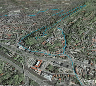
 The big advantage is of course, that you don't need any intermediate steps, like exporting a history file from TC, uploading this to one of the other converters and then loading it into Google Earth. All the data is present in the generated file (like time or distance elapsed, heart rate and cadence), alas only in text form. The track consists of many dots, which display the information when clicked on. Only the track itself is shown - if you can see it through all the small icons.
GPSies
download KML file
 GPSies does far more than just converting various input formats (among them GPX, TCX and PCX5) to different output formats (Google Maps, Google Earth and many GPS applications), it allows you to store your tracks and share them with other people. It is a big community of GPS users.
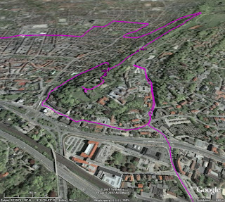
But for now I am only interested in the converter. The first problem was, that it did not accept the current format exported by Training Center. But GPSies uses the Garmin Communicator Plugin, which allows direct upload from the GPS device to a web application, so I used this method. Unfortunately, only the track is visualised, without any further information.
GPS Visualiser
download simple KMZ file
 Like GPSies, this application can convert between many, many formats. Actually, it has two interfaces: A simple one and a more complex one. In the simple one, you just upload your file and the resulting KMZ file looks very much like the result from GPSies. The fun starts when you use the complex interface.
download complex KMZ file
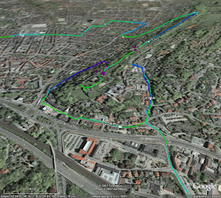 In this interface, you can configure many aspects of the conversion. For example, you can insert distance markers at given intervals, which are shown as small arrows indicating the direction. Or you can colorise the track according to further data, like speed, altitude, or, as shown in the example above, heart rate. You can tune and twist nearly every aspect of the resulting file.
Garmin Training Center to KML Converter
download KML file
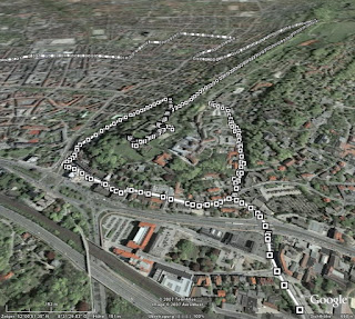
 My own stab at this subject tries to visualise as many data as possible, but without scaring off the user with a complex interface. All data is put into the generated KML file, and you can select in Google Earth, which part you want to see. The image above shows the basic track and distance markers (which are shown only at a fixed distance of one kilometer).
 Optionally, you can display heart rate (as above) or cadence, if you have the appropriate sensors. Unlike GPS Visualiser, I choose to display this information with "walls" instead of colors (mainly because this was easier to do in XSLT). I think both methods have their pros and cons, YMMV.
Conclusion
As I said, I am severly biased. Considering my personal requirements, i.e. showing my GPS data in Google Earth, my winner is GPS Visualiser, but of course I have a soft spot for my own converter. I think in terms of ease of use, I can outrun GPS Visualiser. Another aspect is, that my converter (thanks to XSLT) seems to be very robust against changes of the export format of Training Center. GPSies (and foreconv) had problems converting the new format, while my converter needed no change. But of course, this is just as much luck as anything.
The contenders are
Noncompetitive participant is foreconv, which was not able to convert the format exported by the current version of Training Center. If you want to do the conversion yourself (maybe even with another converter), you can download the history file exported from TC.
I have to admit that this comparison is not really fair. All programs have different scopes and do a lot of different things. GPSies and GPS Visualiser can read and write many different formats, compared to my converter which reads TCX and writes KML exclusively. But let's have a look anyway.
Garmin Training Center
download KMZ file
 The big advantage is of course, that you don't need any intermediate steps, like exporting a history file from TC, uploading this to one of the other converters and then loading it into Google Earth. All the data is present in the generated file (like time or distance elapsed, heart rate and cadence), alas only in text form. The track consists of many dots, which display the information when clicked on. Only the track itself is shown - if you can see it through all the small icons.
GPSies
download KML file
 GPSies does far more than just converting various input formats (among them GPX, TCX and PCX5) to different output formats (Google Maps, Google Earth and many GPS applications), it allows you to store your tracks and share them with other people. It is a big community of GPS users.
But for now I am only interested in the converter. The first problem was, that it did not accept the current format exported by Training Center. But GPSies uses the Garmin Communicator Plugin, which allows direct upload from the GPS device to a web application, so I used this method. Unfortunately, only the track is visualised, without any further information.
GPS Visualiser
download simple KMZ file
 Like GPSies, this application can convert between many, many formats. Actually, it has two interfaces: A simple one and a more complex one. In the simple one, you just upload your file and the resulting KMZ file looks very much like the result from GPSies. The fun starts when you use the complex interface.
download complex KMZ file
 In this interface, you can configure many aspects of the conversion. For example, you can insert distance markers at given intervals, which are shown as small arrows indicating the direction. Or you can colorise the track according to further data, like speed, altitude, or, as shown in the example above, heart rate. You can tune and twist nearly every aspect of the resulting file.
Garmin Training Center to KML Converter
download KML file
 My own stab at this subject tries to visualise as many data as possible, but without scaring off the user with a complex interface. All data is put into the generated KML file, and you can select in Google Earth, which part you want to see. The image above shows the basic track and distance markers (which are shown only at a fixed distance of one kilometer).
 Optionally, you can display heart rate (as above) or cadence, if you have the appropriate sensors. Unlike GPS Visualiser, I choose to display this information with "walls" instead of colors (mainly because this was easier to do in XSLT). I think both methods have their pros and cons, YMMV.
Conclusion
As I said, I am severly biased. Considering my personal requirements, i.e. showing my GPS data in Google Earth, my winner is GPS Visualiser, but of course I have a soft spot for my own converter. I think in terms of ease of use, I can outrun GPS Visualiser. Another aspect is, that my converter (thanks to XSLT) seems to be very robust against changes of the export format of Training Center. GPSies (and foreconv) had problems converting the new format, while my converter needed no change. But of course, this is just as much luck as anything.
2007-10-23
Update: Garmin Training Center to Google Earth
My Training Center to Google Earth converter is now able to display tracks in their recorded altitude. While this is not relevant for ground based activities, if you go paragliding, ultralight flying or canonball riding, this might be an interesting additional information for you. Please check the converter's web page how to turn on this mode.
I used a recent trip to Madrid to collect some data to demonstrate this feature. Alas, just to find out, that the barometric altimeter of my GPS device of course gives wrong readings in a pressurised cabin. The plane was not flying at an altitude of 2000 meters, it was a little bit higher. But you get the idea. By the way: Flying directly over the city center of Paris at night time is quite an experience :)
2007-08-19
Garmin Training Center to Google Earth Converter
I have enhanced my "Garmin Training Center to KML converter", which I mentioned some time ago for the first time. If you have a GPS appliance and use Training Center to manage your activities and courses, you can view them in Google Earth.
The converter is based on XSLT, as both the input and the output format are XML. You can either download the XSLT script or upload your .tcx files on my website. As a preview, download some of my rides of the last weeks.
2007-08-10
Deutschlandtour 2007 in Google Maps und Google Earth
Eigentlich wollte ich zur Deutschlandtour 2007 wenig bis garnichts schreiben. Zum einen wegen der radfahrerischen Gesamtsituation, zum anderen, weil sie dieses Jahr - abgesehen von der letzten Etappe nach Hannover - eine rein süddeutsche Angelegenheit ist.
Aber da Google in den letzten Tagen diverse Suchende zu meinem Artikel vom letzten Jahr geführt hat, und die von der ARD angebotene KMZ-Datei für Google Earth sowas von bescheiden gemacht ist, gibt's die üblichen geodätischen Handreichungen von mir: Entweder alles zusammen in einer KMZ-Datei, oder die einzelnen Etappen via Google Maps:
- 1. Etappe (10.8.2007): Saarbrücken - Saarbrücken
- 2. Etappe (11.8.2007): MZF: Bretten
- 3. Etappe (12.8.2007): Pforzheim - Offenburg
- 4. Etappe (13.8.2007): Singen - Sonthofen
- 5. Etappe (14.8.2007): Sonthofen - Sölden
- 6. Etappe (15.8.2007): Längenfeld - Kufstein
- 7. Etappe (16.8.2007): Kufstein - Regensburg
- 8. Etappe (17.8.2007): EZF: Fürth
- 9. Etappe (18.8.2007): Einbeck - Hannover
2007-07-20
Neues Spielzeug
Ich weiß nicht, ob ich es schon mal erwähnt habe, aber ich fahre gerne mit dem Rad. Bisher habe ich das mit einem recht konventionellen Tourenrad gemacht, aber ich hatte schon länger den Wunsch, auf etwas sportlicheres umzusteigen. Aber ein echtes Rennrad sollte es eigentlich auch nicht sein, also schaute ich einfach mal beim Fahrradladen meines Vertrauens vorbei, und gleich das erste Modell, das mir präsentiert wurde, war genau das richtige:

Ein "Roadster" der in Leopoldshöhe ansässigen Firma Patria, von der auch schon mein vorheriges Rad stammte. Das besondere ist, dass der Rahmen dort noch selber hergestellt wird, und zwar ganz klassisch aus gemufften Stahlrohren anstatt verschweißtem Aluminium. Da ich auf einen Gepäckträger und Schutzbleche verzichtet habe, ist es erheblich leichter als sein Vorgänger, und sieht dank der schmaleren Reifen trotzdem ziemlich sportlich aus. Genaugenommen war mir das Rad schon vor ein paar Jahren im Laden aufgefallen, daher musste ich jetzt nicht wirklich lange überlegen.
Der Umstieg von der bisherigen 7-Gang-Nabenschaltung auf eine 27-Gang-Kettenschaltung ging recht schnell. Auch die etwas andere Sitzposition gefällt mir deutlich besser (wobei ich noch gespannt bin, welche "Sitzfläche sich im Laufe der Zeit anpasst", die des Brooks-Sattels, oder doch eher meine...). Als nach zwei Wochen und 200 gefahrenen Kilometern die Erstinspektion fällig war, bin ich fast von meinem alten Rad gefallen, als ich es ersatzweise wieder benutzt habe. Da habe ich mich gefragt, wie ich all die Jahre bloß mit dem Teil fahren konnte.
Und wenn ich mit dem Rad unterwegs bin, ist auch immer GPS dabei. Leider hat das alte Gerät im Laufe der Jahre etwas gelitten, und da Garmin gerade ein neues Spielzeug speziell für Radfahrer herausgebracht hatte, habe ich einfach mal zugegriffen:

Links das alte Geko 201, rechts das neue Edge 305. Bei mehr Funktionen und größerem Display ist das Gerät nochmal etwas kleiner geworden. Vor allem habe ich mich dann mal nicht lumpen lassen und gleich die Ausführung mit Pulsmesser und Trittfrequenz-Zähler genommen.
Leider ist das Gerät anscheinend so neu, dass es von der bisher von mir verwendeten Software "Touratech QV" nur unzureichend unterstützt wird. Bisher war ich es gewohnt, mir am Rechner Routen zusammenzuklicken, an das Gerät zu übertragen und dann abzufahren. Das Edge ist für diese Art der Benutzung eigentlich garnicht gedacht, sondern es soll ein Trainingsgerät sein, um seine Leistung auf gleichbleibenden (und vor allem bereits bekannten) Strecken zu kontrollieren und zu verbessern. So kann man eine einmal gefahrene Route wiederholen und quasi "gegen sich selbst" als virtuellen Gegner antreten.
Zentrale Software dabei ist das Garmin Training Center:

Damit kann man sich gefahrene Strecken ansehen und diverse Parameter analysieren. Netterweise werden vor allem Herz- und Trittfrequenz vom Edge kontinuierlich aufgezeichnet, so dass man sich diese auch im Nachhinein ansehen kann. Es sind sogar komplette Trainingsprogramme enthalten. Ob ich die allerdings wirklich mal ernsthaft absolviere, weiß ich noch nicht.
Leider ist es aber eben nicht mit diesem Programm möglich, Routen im voraus zu erstellen. Das geht zwar im Prinzip mit dem Programm "MapSource" von Garmin, aber es gibt keine Möglichkeit, Routen vom einen in das andere Programm zu übertragen. Da muss Garmin meiner Meinung nach noch gaaaaanz kräftig nachbessern. Erst mit Hilfe von zusätzlicher (und zum Glück freier) Software ist es möglich, mit MapSource oder TTQV erstellte Routen in ein Format zu konvertieren, das vom Training Center verstanden wird.
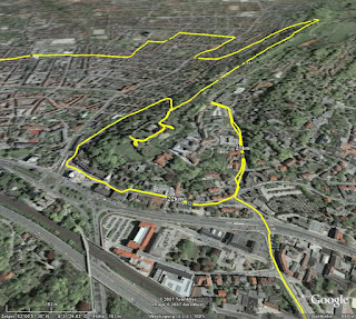
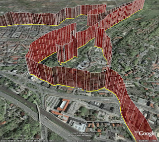
Leider kann man im Training Center aber nicht mehrere Aufzeichnungen gleichzeitig darstellen, und die getrennte Sicht auf Strecke und Leistungsdaten erleichtert die Analyse auch nicht unbedingt. Netterweise kann man aber die gesamten Daten in einer XML-Datei ablegen, und damit sind es nur noch ein paar Zeilen XSLT, das ganze in Google Earth darzustellen. In dieser KML-Datei sind meine "erfahrenen" Strecken der ersten zwei Wochen dargestellt. Auf Wunsch kann man sich den Puls und/oder die Trittfrequenz mit anzeigen lassen. Und nun kann man auf einmal sehr schön erkennen, an welchen Steigungen der Puls nach oben ging ...

... (und ich erstmal ein paar Minuten pausieren musste, um wieder zu Atem zu kommen) und in welchen (mir unbekannten) Kurven ich mich nicht getraut habe, voll durchzutreten ...

Das ganze läßt sich bestimmt noch weiterentwickeln, nicht zuletzt, weil im Training Center und der XML-Datei noch eine ganze Reihe mehr an Informationen stecken. Alles in allem haben sich die Anschaffungen gelohnt und das Radfahren hat nochmal einen ganz neuen Reiz bekommen.

Ein "Roadster" der in Leopoldshöhe ansässigen Firma Patria, von der auch schon mein vorheriges Rad stammte. Das besondere ist, dass der Rahmen dort noch selber hergestellt wird, und zwar ganz klassisch aus gemufften Stahlrohren anstatt verschweißtem Aluminium. Da ich auf einen Gepäckträger und Schutzbleche verzichtet habe, ist es erheblich leichter als sein Vorgänger, und sieht dank der schmaleren Reifen trotzdem ziemlich sportlich aus. Genaugenommen war mir das Rad schon vor ein paar Jahren im Laden aufgefallen, daher musste ich jetzt nicht wirklich lange überlegen.
Der Umstieg von der bisherigen 7-Gang-Nabenschaltung auf eine 27-Gang-Kettenschaltung ging recht schnell. Auch die etwas andere Sitzposition gefällt mir deutlich besser (wobei ich noch gespannt bin, welche "Sitzfläche sich im Laufe der Zeit anpasst", die des Brooks-Sattels, oder doch eher meine...). Als nach zwei Wochen und 200 gefahrenen Kilometern die Erstinspektion fällig war, bin ich fast von meinem alten Rad gefallen, als ich es ersatzweise wieder benutzt habe. Da habe ich mich gefragt, wie ich all die Jahre bloß mit dem Teil fahren konnte.
Und wenn ich mit dem Rad unterwegs bin, ist auch immer GPS dabei. Leider hat das alte Gerät im Laufe der Jahre etwas gelitten, und da Garmin gerade ein neues Spielzeug speziell für Radfahrer herausgebracht hatte, habe ich einfach mal zugegriffen:

Links das alte Geko 201, rechts das neue Edge 305. Bei mehr Funktionen und größerem Display ist das Gerät nochmal etwas kleiner geworden. Vor allem habe ich mich dann mal nicht lumpen lassen und gleich die Ausführung mit Pulsmesser und Trittfrequenz-Zähler genommen.
Leider ist das Gerät anscheinend so neu, dass es von der bisher von mir verwendeten Software "Touratech QV" nur unzureichend unterstützt wird. Bisher war ich es gewohnt, mir am Rechner Routen zusammenzuklicken, an das Gerät zu übertragen und dann abzufahren. Das Edge ist für diese Art der Benutzung eigentlich garnicht gedacht, sondern es soll ein Trainingsgerät sein, um seine Leistung auf gleichbleibenden (und vor allem bereits bekannten) Strecken zu kontrollieren und zu verbessern. So kann man eine einmal gefahrene Route wiederholen und quasi "gegen sich selbst" als virtuellen Gegner antreten.
Zentrale Software dabei ist das Garmin Training Center:

Damit kann man sich gefahrene Strecken ansehen und diverse Parameter analysieren. Netterweise werden vor allem Herz- und Trittfrequenz vom Edge kontinuierlich aufgezeichnet, so dass man sich diese auch im Nachhinein ansehen kann. Es sind sogar komplette Trainingsprogramme enthalten. Ob ich die allerdings wirklich mal ernsthaft absolviere, weiß ich noch nicht.
Leider ist es aber eben nicht mit diesem Programm möglich, Routen im voraus zu erstellen. Das geht zwar im Prinzip mit dem Programm "MapSource" von Garmin, aber es gibt keine Möglichkeit, Routen vom einen in das andere Programm zu übertragen. Da muss Garmin meiner Meinung nach noch gaaaaanz kräftig nachbessern. Erst mit Hilfe von zusätzlicher (und zum Glück freier) Software ist es möglich, mit MapSource oder TTQV erstellte Routen in ein Format zu konvertieren, das vom Training Center verstanden wird.
Leider kann man im Training Center aber nicht mehrere Aufzeichnungen gleichzeitig darstellen, und die getrennte Sicht auf Strecke und Leistungsdaten erleichtert die Analyse auch nicht unbedingt. Netterweise kann man aber die gesamten Daten in einer XML-Datei ablegen, und damit sind es nur noch ein paar Zeilen XSLT, das ganze in Google Earth darzustellen. In dieser KML-Datei sind meine "erfahrenen" Strecken der ersten zwei Wochen dargestellt. Auf Wunsch kann man sich den Puls und/oder die Trittfrequenz mit anzeigen lassen. Und nun kann man auf einmal sehr schön erkennen, an welchen Steigungen der Puls nach oben ging ...

... (und ich erstmal ein paar Minuten pausieren musste, um wieder zu Atem zu kommen) und in welchen (mir unbekannten) Kurven ich mich nicht getraut habe, voll durchzutreten ...

Das ganze läßt sich bestimmt noch weiterentwickeln, nicht zuletzt, weil im Training Center und der XML-Datei noch eine ganze Reihe mehr an Informationen stecken. Alles in allem haben sich die Anschaffungen gelohnt und das Radfahren hat nochmal einen ganz neuen Reiz bekommen.
2007-07-05
Le Tour de la dernière Chance
Wie blöd muss man eigentlich sein, sich in diesem Jahr noch für professionellen Radsport im allgemeinen und die Tour de France im speziellen zu interessieren? Da outen sich alle paar Tage ehemalige oder fast ehemalige Fahrer und Betreuer und beichten, was wir alle irgendwie immer schon geahnt haben. Da wird zugegeben, dass man vor langer Zeit mal mit EPO experimentiert hat - aber vor genau fünf Jahren war Schluss damit. Ein Schelm, wer böses dabei denkt (siehe Abschnitt 8.5.(3)).
Man darf gespannt sein, ob ARD und ZDF wirklich die Reissleine ziehen und die Berichterstattung beenden, falls es bei der diesjährigen Tour zu Unregelmäßigkeiten kommt. Aber vielleicht ist das der einzige Weg zur Heilung des Systems: Die Sponsoren wenden sich ab, es gibt nicht mehr das große Geld zu holen, und es lohnt sich einfach nicht mehr, auf Teufel komm 'raus gewinnen zu müssen. Fairerweise sollten dann aber die gleichen Maßstäbe auch in anderen Sportarten angelegt werden, z.B. in der Leichtathletik.
Oder aber man verschließt (ein wenig) die Augen, sieht die Tour wieder als großes Happening, bei dem mal viel schöne Gegend präsentiert bekommt, und erfreut sich der technischen Spielereien, die möglich sind. So bietet auch dieses Jahr wieder Ubilabs einen Liveticker an, und von mir gibt es den gewohnten Service: Die Etappen für Google Maps und Google Earth. Die Rohdaten stammen wieder von der ARD.
Entweder kann man sich die ganze Tour für Google Earth in einer KMZ-Datei herunterladen, oder man sieht sich die einzelnen Etappen mit Google Maps an:
- Prolog (7.7.2007): London
- 1. Etappe (8.7.2007): London - Canterbury
- 2. Etappe (9.7.2007): Dünkirchen - Gent
- 3. Etappe (10.7.2007): Waregem - Compiègne
- 4. Etappe (11.7.2007): Villers-Cotterêts - Joigny
- 5. Etappe (12.7.2007): Chablis - Autun
- 6. Etappe (13.7.2007): Semur-en-Auxois - Bourg-en-Bresse
- 7. Etappe (14.7.2007): Bourg-en-Bresse - Le Grand-Bornand
- 8. Etappe (15.7.2007): Le Grand-Bornand - Tignes
- 9. Etappe (17.7.2007): Val d'Isère - Briançon
- 10. Etappe (18.7.2007): Tallar - Marseille
- 11. Etappe (19.7.2007): Marseille - Montpellier
- 12. Etappe (20.7.2007): Montpellier - Castres
- 13. Etappe (21.7.2007): Albi - Albi (EZF)
- 14. Etappe (22.7.2007): Mazamet - Plateau-de-Beille
- 15. Etappe (23.7.2007): Foix - Loudenvielle-de Louron
- 16. Etappe (25.7.2007): Orthez - Gourette (Col d'Aubisque)
- 17. Etappe (26.7.2007): Pau - Castelsarrasin
- 18. Etappe (27.7.2007): Cahors - Angoulême
- 19. Etappe (28.7.2007): Cognac - Angoulême (EZF)
- 20. Etappe (29.7.2007): Marcoussis - Paris (Champs-Élysées)
Zunächst über fast 160 Kilometer ein ziemliches Einerlei im lockeren Ausdauertempo von 33 - 35 km/h ...
Im Feld wird Promenadentempo gefahren, .... Wirklich ein ungewöhnlich langsamer Etappenverlauf im Grundlagenausdauerbereich.
Es herrscht fröhliche Eintracht im Feld, das ganze heute über weite Strecken zu einer halbwegs erholsamen Ausfahrt zu gestalten.Natürlich war das Tempo nicht so niedrig, weil heute kein einziger Fahrer unter Drogen stand, und selbst ein nicht-gedopter Spitzenfahrer könnte sicherlich schneller fahren. Aber ich denke es verdeutlicht die Erwartungshaltung, die nicht zuletzt von den Medien ausgeht. Ich will hier jetzt auf keinen Fall den Eindruck erwecken, ich würde Doping befürworten, aber wenn die Medien die Sportler so auf fairen und unmanipulierten Sport drängen, dann sollten sie auch bereit sein, mit den Konsequenzen zu leben. Alles unterhalb einer absoluten Spitzenleistung ist schon schlecht. Wie Erik Zabel (lange vor seiner Beichte) mehrfach mit Blick auf die Berichterstattung beklagte: "Der zweite Sieger ist schon der erste Verlierer."
Abonnieren
Posts (Atom)